New Name and New Logo***UPDATED***

Iain@CRD

Lifer
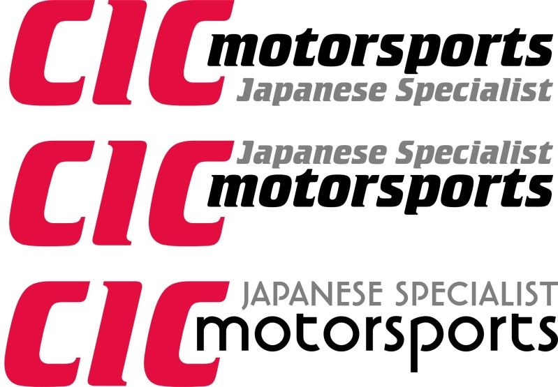
After spending alot of time debating the new business name with the endless possibilities i finally decided to settle on the one below. I wanted to try and keep it simple, unique to myself aswell as easy on the eye and i think we accomplished this.

Below we have an example of the final 2 edits of our image, the second image is yet to be adjusted on the font for Motorsports to be the same font as the specialist just to allow it to be more clearer.

Please do let me know your opinions on both the name and images! We are playing around with the wording of "Japanese Specialist or Parts Specialist" etc.

CIC = Cochrane Innovations & Creations.

photo_zpscc9da066.jpg


photo_zps9c6819a5.jpg
 
Last edited:

Iain@CRD

Lifer
looks like and old design back from the 90's sry mate just what i think!

Your welcome to your opinion Shel, its hard to find a balance where everyone will like the new image. I just feel that too much time is being wasted and spent on designing a new name and image now :).

out of the 2, top one but with 'japanese specialists' underneath motorsports.

Thanks Dunc, that was the original plan but i gave the designer freedom to come up with there own idea's. I will ask him to make a copy of what you said and we shall see how it turns out!
 

Iain@CRD

Lifer
I do take onboard what you have said Gryzor and at first glance with the colouring it does come across as if its similar to before, tho the designer i sent it over too has never seen the old CRD design... I only presented him with an example of another logo I wanted without being a direct copy.

The idea of having some imagery is excellent and it is definately in the pipline at the somepoint, i chose the "Motorsports" theme as thats not done as much in comparrsion to Performance/Developments and also Motorsports is the direction i can to move towards, it also sets me apart from local businesses though with some good advertising the locals will realise i offer the same services but just a wider range and possiblities.

There has been alot of time elapsed since i decided to change the name and trying to develop something unique is difficult in this market, the business will remain family orientated and would never be sold on hence why i settled on a name that has meaning to me personally.

Hope this helps to explain some of it!
 

GT-TD04

Supermoderator
Stronger colours are needed I think,the pink just makes it look a bit washed out.

Might be better off designing your own font just for the logo,it would make it unique to yourself and can't come under royalties etc
 
Top